Photography

We will be able to discuss a few of the most important elements we can apply to photography(leading lines, rule of thirds and depth of field). This 3 tips main purpose is to allow you create better images. Allows any one from beginner to advance to achieve or obtain a better quality in the pictures taken. The pictures used are some found on the web by pages that allow you to use them and some taken by me utilizing the following: Depth of Field, Leading Lines and Rule of Thirds.

Leading Lines

http://pickupimage.com/download-photos/Empty-road-leading-to-snow-covered-mountains-Iceland/2320532

In this image our eyes are guided and leaded to the mountains in straight lines. Having place those leading lines forward allows and gives a depth of field making the mountain look colossal. The following image was obtain at the following link: http://pickupimage.com/download-photos/Empty-road-leading-to-snow-covered-mountains-Iceland/2320532 by
bluelagoon at pickupimage.com.      

Leading Lines : The yellow post are place on both side of the road, leading to the beautiful mountains. Also place in the middle of the road we have the continuous white lines leading as well to the mountains. In the road the edge are straight forward leading along with every other element  to the mountain, allowing the viewer eyes to focus on the beautiful view of the mountain.

Leading lines by Emi Reyes


Leading lines created in the image above are created along the side of the road in a straight direction. Directing your eye forward, along with the white consecutive lines in the middle of the road. Image taken by Emi Reyes .

Rule of Thirds

In this image the bike is the element that stands out the most. The Rule of Thirds in photography is created by placing the most important element in places where lines intersect. To create those lines the image is divided in 9 segments, by two vertical and two horizontal lines. This image was found at designrush.com and the link: https://www.designrush.com/resources/publicdomainarchive/73-free-high-resolution-public-domain-images/

We can clearly observe that after dividing the image in nine segments the bike is place on a point were two lines intersect. Even though the image obtains more things our eye is drawn to the bike. Allowing this image to be the right example of rule of thirds.

By Emi

In the images above we can observe the rule of thirds. Focusing on the cookie that is being held by the hand. It is position it’s right were the two lines intersect horizontally and vertically. Allowing the cookie to be the first thing to be seen by the eye.

Depth of Field

Depth of field is created in an image by selecting the accompanying elements carefully. In this image the background, our eye is directed to the man in the middle, he stand out with his bright orange jacket in a white and dark green background of trees. Image found: Photo by Zachary Kyra-Derksen on Unsplash

We can observe how the man standing in the middle of the picture draws attention to the eye and is the first one to be notice among the huge trres that surround him.

Image by Emi Reyes

Depth of field created by focusing the image on the pot and pepper on top of the grill and giving and creating a distance with the background.

Its very challenging to create and come up with the finest and sharpest images, but by allowing yourself to follow the steps above it is possible. I used to not pay attention to the things place on the background of what I wanted to focus my image, but this was not allowing me to come up with the best. I can clearly see how easier it has become to slowly pay attention to what is leading my image, the placement of the objects and the effects we can create with the background.

Recognizing Typography

The image above will be use to analyze different typefaces and contrast created within this ad. It will help us visualize the importance of creating a well design ad by using different typefaces, size and color. The ad was found at https://websigns4u.com/wp-content/uploads/2018/07/hair-product-magazine-ads-ad-by-olay-in-people-is-the-middle-of-rhmediumcom-lovely-max-factor-geminesse-lipstick-rhromvinfo-lovely-768×1024.jpg.

hair product magazine ads ad by olay in people is the middle of rhmediumcom lovely max factor geminesse lipstick rhromvinfo lovely

Typography #1

It is found in the tittle in the word PANTENE. We can see it has bracketing at the beginning and end of each letter. It presents a moderate thick to thin transition, it also shows serifs. It is also the focal point on the type, because of being bold, black and size (filling up the page horizontally).

hair product magazine ads ad by olay in people is the middle of rhmediumcom lovely max factor geminesse lipstick rhromvinfo lovely

Typography #2

It is represented in the second set of typefaces. We can clearly observe that it is different in size. It is used with two different colors. It is the second type our eyes will focus on in the ad. It is strong, heavy and bold even though smaller in size. It has a lack of serif, and there is no thick/thin transition in the strokes.

Contrast

In this case contrast is represented in the form of size and color.We can appreciate the word Pantene being bold, black and filling up the page horizontally. In the contrary the type at the bottom is smaller and presented in two colors (black & gold). The use of two different typefaces create an effective design.

hair product magazine ads ad by olay in people is the middle of rhmediumcom lovely max factor geminesse lipstick rhromvinfo lovely

The image was a good example to analyze and recognize at least two different typefaces and the contrast created by the different sizes and colors use (black & gold). We can clearly see the focal point in the word PANTENE, then slowly directing our attention to the next set of type and so on. It is a well organize and clean design.

Adidas Ad

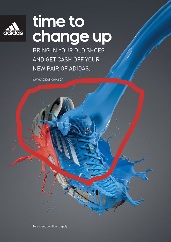
The following is an image of a tennis shoe of the brand Adidas used for an ad. It will be use to recognized the most important principles in design. The image above was found on google images, but I was redirected to the following link:  http://www.koinoniazambia.org

Alignment

It is represented in this image with the typeface along with the tennis shoe being align to the left. Allowing for more white space and giving it a cleaner look.

Color

In this ad we can see that color is being repeated with the use of black and gray, not only in the background but on the tennis shoe. This gives the opportunity to ad 2 bright colors to make the image pop even more and the use of white in the typeface to differentiate and not get lost to attract the consumer even more.

Repetition

It is found in the use of color (white) on the typeface to create a sense of unity. Most importantly the used of the same lowercase font found on the logo and the content of the ad communicating to consumer or viewer that it is as important as the name of brand.

Contrast

It is well represented with the used of light & dark colors, but specially the use of red and blue to create interest to the viewer. It allows excitement to the ad. Another element creating contrast is the font size being bigger on top but they are all lowercase, and at the bottom they are smaller but all caps.

Proximity

It is found in the connection created with the font, being place so close together gives a sense of unity. The relationship between them indicates they are all important. It provides a more organized look to the ad, allowing for more space for the image.

This ad is very clean and simple yet provides with all the design principles. Being a shoe campaign in which you need to emphasize the image to attract the consumer and at the same time make sure there is no loss of interest by so many elements going around this ad is a good example, subtle and simple color used in the font, a very simple background and tennis shoe with a splash of red an blue to make the ad pop.